When we present data in a report or spreadsheet we often use some type of graph or chart to make the information clearer to understand. Unfortunately, using the wrong type of presentation can confuse the reader.
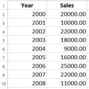
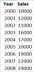
Consider these data:
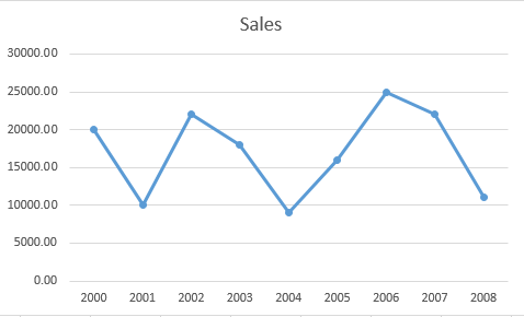
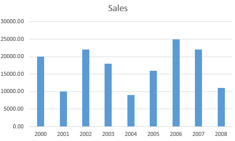
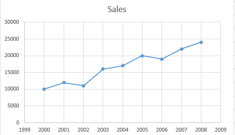
And these two presentations:
Intuitively, the second seems easier to read, but why? The first is a line chart there are lines between the data points and that implies that if we looked somewhere between the two points, we'd be able to see something along that line. But there is nothing between 2005 and 2006! These are discreet values on the independent (horizontal) axis. A line chart is generally used to provide for interpretation of data between points or to show a trend. Since these data really don't show a trend, it's hard justify its use here.
When we have discreet values: one for each year. In this case a bar chart is more appropriate because we want to compare values absent a trend.
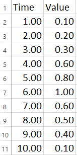
Now consider:
Here we want to show a trend, so a line is appropriate:
The dots at the data points are designed to make it clear that these are specific data points for comparison. To emphasize that it is the trend we want to show, we can add a trendline.
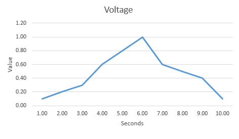
Let's look at some data values taken over time:
And this line chart:
In this case we can probably safely assume that at 8.5 seconds the value was roughly .45 volts. Note the lack of dots at the data points. Even though this is discreet data, it is designed to represent something continuous.
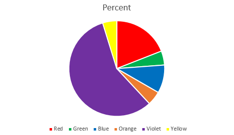
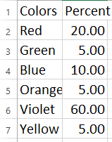
Another common type of chart is the pie chart. It is designed to show parts of a whole. Consider this sample data:
Here I want to show the reader a comparison of the popularity of some colors of some flowers. Neither a line or bar chart is really appropriate, but a pie chart is great.
I have taken a few liberties in these examples: the datasets are small in order to make the examples easy to follow, and the labels have been simplistic. When creating charts or plots to include in a presentation or paper it is important to follow the advice of my high school physics teacher: "make the axis labels and title so clear your best friend can understand them".
There are many more chart types and considerations including histograms, using logarithmic values for axes, and many others. I hope to discuss those in a subsequent post.